Today we will speak a bit about the work in progress of the Technology tree, and the main GUI style/philosophy evolution.
The visual style is evolving and becoming more mature. The aim is to be as functional as possible, and also be pleasant to interact with, always having in mind the limitations of making it work in our engine. This is why we bet for a neutral and sober look that helps to focus on the relevant elements, without the distraction of possible decorative elements. This is not easy to decide, because the tradition of video-games is very rich in decorative GUI elements, and I'm sure that many of you would prefer having screws and rust in the corners of the metal panels and cables hanging everywhere in the GUI. Me too. Sometimes. I believe that once the GUI is completely functional, there will be some minimal decoration and this kind of fantasy, but this will be another chapter if it ever happens.
We are paying a lot of attention to the readability in general, according to the AAA standards of the WCAG. So the contrast with the panels and the font is increased quite a lot compared to previous mock-ups by simply using a contrast checker. Also the font size is increased by 2pt so it is more comfortable to read. Anyway, the user will have control of the font size in the options menu.
Bear in mind that the next mock-ups are a work in progress, and we still developing our standards, so some colours and solutions can vary through further iterations.
This picture shows the actuality of the state of the technology tree:

As you can see in the top left frame we added a new functionality. In this panel you can organize the order of your researches and see the progress in real time. The player will be able to cancel a queued technology just by hovering the card and pressing the cancel button. This progress is attached to the card, and will also be visible in the tree itself. See the screen below. The fluid wagon has been researched and you can see this in the tree and in the queue. By using the principle that, when the GUI tells you about some element, it always tries to use this very element, not a representation of it in another frame of the screen.
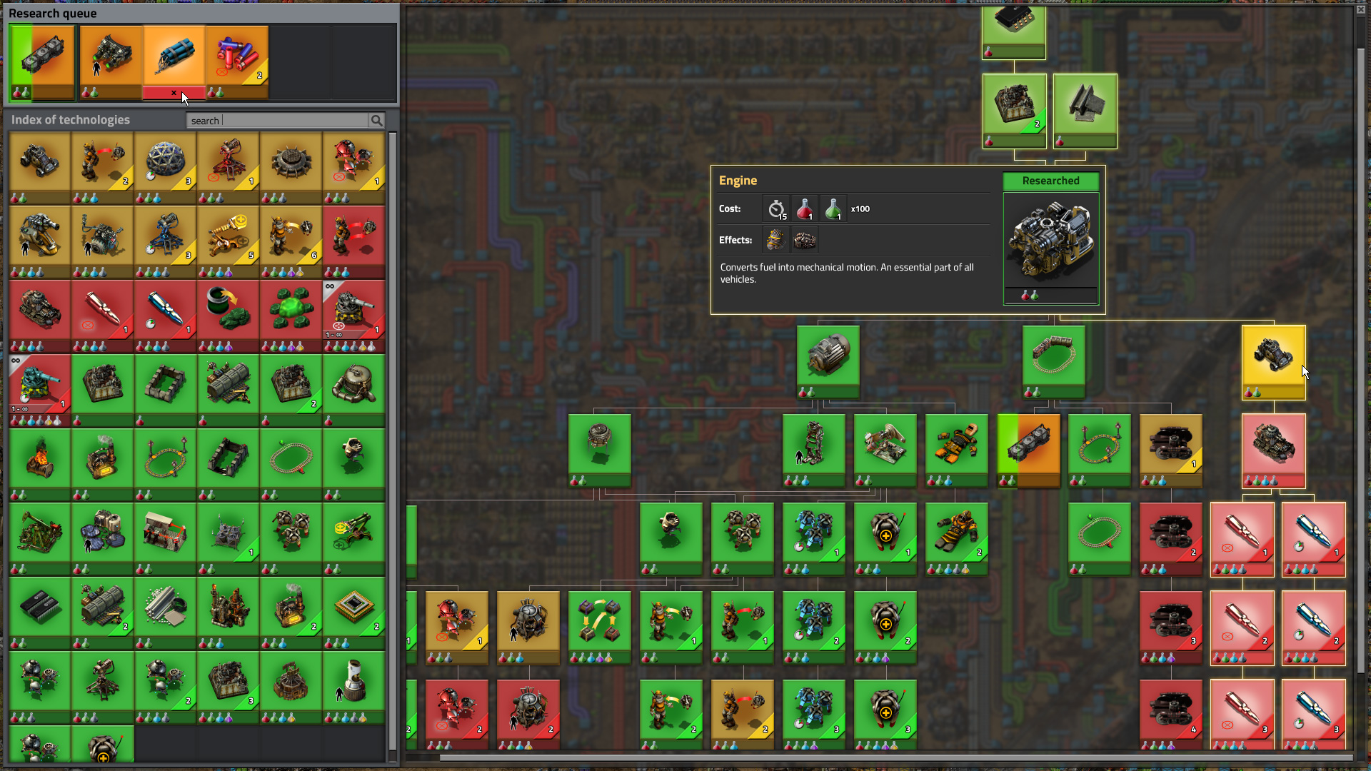
The index of technologies remains as it is, but the position of the Featured technology frame is now attached to the tech tree, next to the technology itself. The link between the type of technology and info or interactions related to it, are physically tied. We are trying as much as possible to interact with the elements in situ, trying not to open unnecessary frames or pop ups of any kind and lose our visual focus.
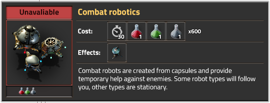
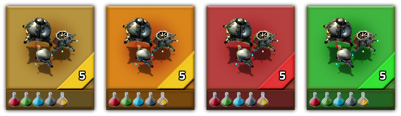
The same happens with the research/queue button. It is placed on top of the featured technology and wraps it with a color indicating it's state, and providing the possible interaction. When the technology is researched, or unavailable, the button appears pressed and the color changes. The color code of the cards remains as before, we have just added a new orange state. Yellow for available, orange for queued, red unavailable, and green researched. As said above, tonalities may change in future, but this is pretty much it.
As this is a dev blog post, it might be nice to show you some internal part of the process. The thing is, that my domain is mainly programming and gameplay, and Alberts domain is graphics. GUI is often something in between, so the two views on the subject tend to be hard to agree on occasionally. In situations like this, and I can tell you that there were a lot of these over the years, we are able to argue for quite some time.
The proposal comes to me and the inevitable discussion about how is the GUI actually going to be implemented. I really love the overall change of the looks, it suddenly looks so much better and professional. But obviously, different people have different priorities, and are used to different things in UI.
I personally had problem understanding, that the Queue button is actually a button on a first glance. I'm used to the standard (not only in Factorio), that a confirmation button is in the right bottom corner of every window. I am also used to the fact that text button just looks the same everywhere, so I can recognize that it is a button instantly.
As a reference I would like to show the blueprint confirm.

It was never designed by Albert, and will be touched by the UI changes in 0.17, but it might be a good lesson about standards for us anyway. It is the confirm like window, that doesn't have the confirmation button as a text button in the right bottom corner. It has a sprite button in the top right corner instead. We have it in the game for quite some time, so we should be used to it, but I still feel like I'm lost for split of second when this window appears and I would actually prefer if it was standardized.
I understand that there is very good reason to have the proposal done this way, both graphically and logically, and I'm aware that Alberts understands the importance of standardisation more than me. We might just have different views on what is the more important principle when these come into conflict. It might be interesting to see what has the reader to say.
As you can see, the GUI re-design tries to be very respectful to the current one, making changes only when is very clear to us that is for the best of Factorio, and not for the sake of changes. I'd like to talk about more subjects, like multi-resolution, HR tile-set, modularity, animations, other mechanics and some more GUI philosophy, but it's late and there are more Fridays.
I'm very curious to see what you think about it in the forums.