Hello,
we are still focusing most of our resources towards fixing as many bugs as possible so we have stable release in reasonable time. In the meantime, the preparation for the continuation of the work on the GUI rewrite is still happening:
Character GUI mockup
The character screen is one of the most used GUI screens in the game, so we need to really try to do it right. We are moving towards the final version of the mockup, so we can start implementing it soon.
Crafting tab
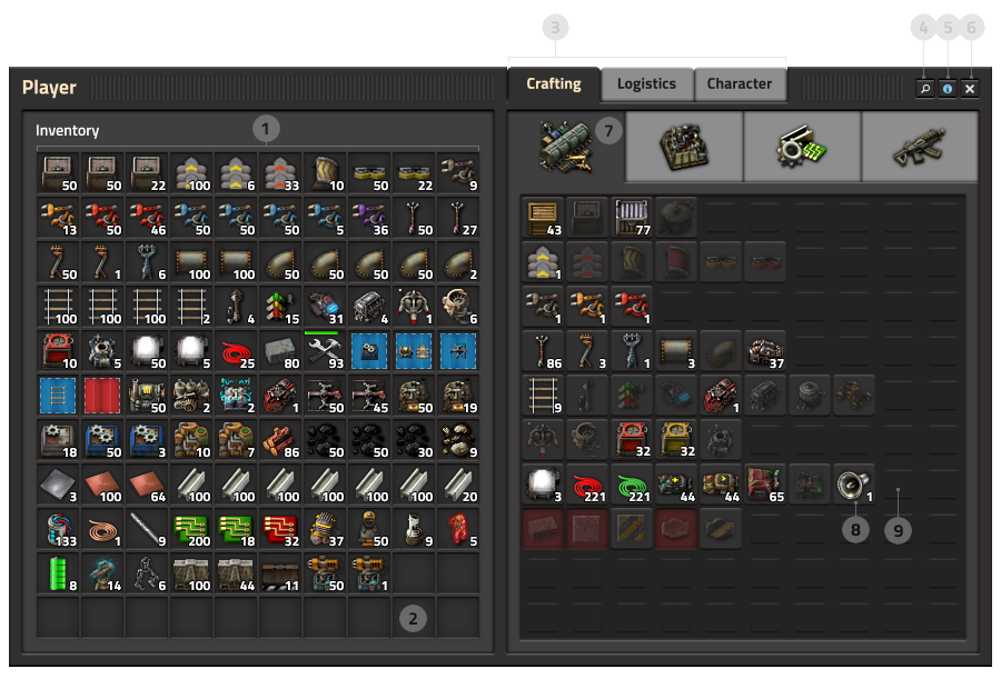
Left frame
- (1) Inventory: We just translated the previous okay mechanics to the new style so we don’t add nor remove any important function.
- (2) Slots: Those are darker now in order to improve the contrast and readability of the icons.
Right frame
- (3) Panel tabs: The regular system of tabs takes quite some extra space, so in order to keep a compact design we decided to use a new system for tabs attached to the panel itself. This is a measure we take due to the importance of this player window compared to some other panels. When a tab is selected it looks like a title for the panel frame and the inactive ones are like regular tabs.
- (4) Search button: After iterating with the design of the new GUI we realised that our actual solution for the search bar is not efficient enough. Our problem was that we were placing it as a tool button in a subheader, so many times we had the situation of placing a subheader in a frame just for the search bar, no tools. This solution takes a lot of space and also can be conflicting with the space for other tools. So we decided to have the search as a panel function attached to the panel and opening it in a floating small window that can be placed anywhere in the layout, certainly very handy.
- (5) Info button: This function opens an overlay with relevant information about the usage of the panel. This is a new feature and we will probably speak with more detail in future posts.
- (6) Close button: You will still closing the panel with escape, no worries, but we need a graphical clue for the newcomer to learn how to close a panel. Those buttons will have tooltips explaining shortcuts and relevant information.
- (7) Category tabs: The “classic” version uses buttons, For a better readability we find more proper using tabs. With a situation of a heavy modded game we will divide the space for the tabs by the number of categories, so we can have as maximum 8 tabs. For more than 8 tabs, we will add new rows below, and we will change the tabs system for the classic buttons solution increasing also the height of the panel until reaching some generous max height, after this we will be forced to use a scroll. But this solution should be very extreme.
- (8) Virtual slots: The classic GUI version uses slots for everything, even for crafting buttons. We decided to go deeper on this concept and we’ve created different kinds of slots. Regular slots are used for “real” items. Things that the player has in the inventory. Virtual slots are referring to the idea of an item. And they should look like a button: like a crafting button. You must be used to them already in the 0.17 series with the action bar.
- (9) Rubber grid: This tileset gives us the idea of dynamic content, and saves the balance in the composition.
Logistics tab
Feature wise, most of the changes are in this tab.
In the current version, there are logistic requests and trash slots presented as two separate tabs:

As you most probably know, the requests are specifying how much to deliver from the logistic network, while the auto trash is used to specify what is the maximum before items are moved to trash slots and taken away back to the network.
There are several problems with this:
- Its possible to request more than you have set in the auto-trash, leading to a infinite loop.
- It is cumbersome to align the values when I want to have the maximum and minimum counts the same.
- The player doesn't see it all in one place
- Auto trash has infinite slots, the requests do not.
This is how the current mockup looks:

These two tabs were merged into one (1). Every slot can specify minimum (the request), maximum or any combination. The amount of slots is infinite.
This means, that the slot have 6 basic variants:
- (2) Requested amount is the same as maximum amount: Just the number of the request is shown.
- (5) Requested amount is specified and maximum (bigger) amount is specified as well: We show the numbers in a column following the order of min/max.
- (6) Requested amount is specified, maximum amount is not limited: Similar as (5), just showing the infinite symbol for maximum.
- (7) Item is not requested (request amount is 0) and maximum amount is specified: We need to show 0 for the request, to differentiate it from (2)
- (8) Item is not requested and maximum amount is 0: When you don't want the item to be ever in your inventory, in this case, we just show no number, same as it is in the auto trash slots now.
But this is not everything, there is one little feature in current version, where you can hover a logistic slots, and see how many robots are on the way, and how many is available in the logistic network. This is very handy thing, but not really practical to use:
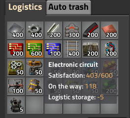
So what we will have is, that the slots themselves will have color styles depending on the state.
- (2) All the items are delivered: The default style.
- (3) items are on the way: Yellow button style (color can change).
- (4) Items not available: Red button style, no items are on the way, and there is not enough items in the network to satisfy the order at this moment.
- There could be one more color for when robots are on the way, but there isn't enough in the logistic network, as when you request something that is just being slowly produced, you will have always one robot coming with the freshly created product, but it would take a long time until there is produced enough. But we need to consider whether it is worth to do it or not.
I imagine this to be useful when I come back to the base to let the logistic robots "refill" my inventory, I can just open the logistic tab, and see how the yellow slots are becoming default color, or easily spot what is missing. I already know in advance, that this is the kind of little feature that I will not understand how could I play without it.
The logistic request slot is kind of an extreme, as we need to show different kinds of information on top of each other (the icon, the slot type, and the request/trash combination type, and I hope that won't look too chaotic to new players.
Character tab

These are basically the leftovers of what the character might need to access/configure. The important thing is the weapons slots being here, which solves the problem of not being sure what shift-click is going to do. Now, when you have logistics tabs opened, shift-click moves to trash slots, and when you have the character tab opened, it moves it to weapons/armor.
Factorio at EGX Rezzed
A small part of the team is at EGX Rezzed this week. If you are attending, be sure to find them in the Indie Basement and pick up some free pins.
 From left to right: Wheybags, Abregado, Klonan, Twinsen, Dominik.
As always, let us know what you think on our forum.